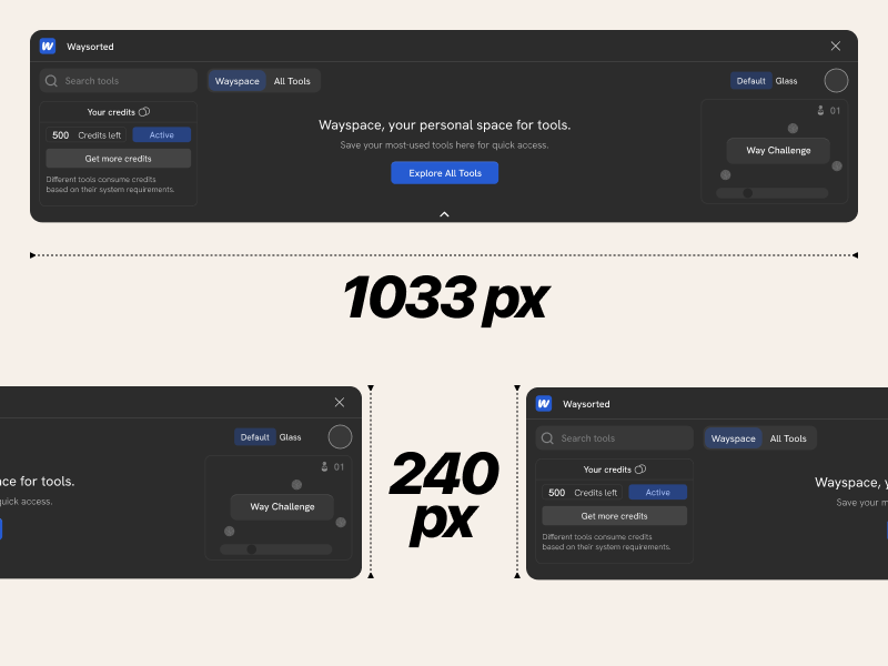
Locking the Canvas Footprint
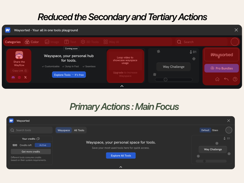
One hard constraint, set early: 1033×240px. No scroll, no deep hierarchy, nothing that needs explaining. Every later decision got faster.
Product Design · Figma Plugin · 2025–26
The tools designers reach for most, bundled into one Figma plugin. No tab-switching. No subscriptions. No lost context.
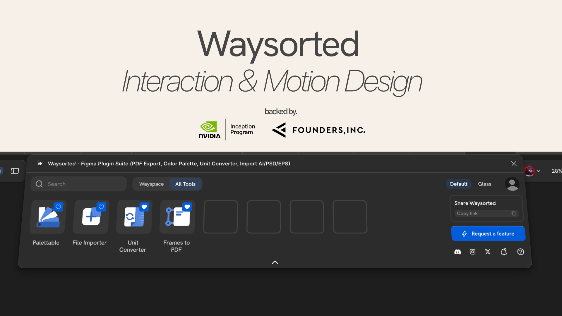
Founders.INC + Nvidia Inception Program
Co-founder & CPO, product direction, design, and distribution
1033×240px. Every design decision lived inside this strip.
800+ users. Featured by a design creator with 170k+ subscribers on YouTube.
The Problem
Designers paid for four or five separate tools to do what should've been built in: a timer, a color picker, a placeholder, a contrast check.
The real cost wasn't the money. It was the interruption. Every switch broke flow, twenty times a day.
Where I Started
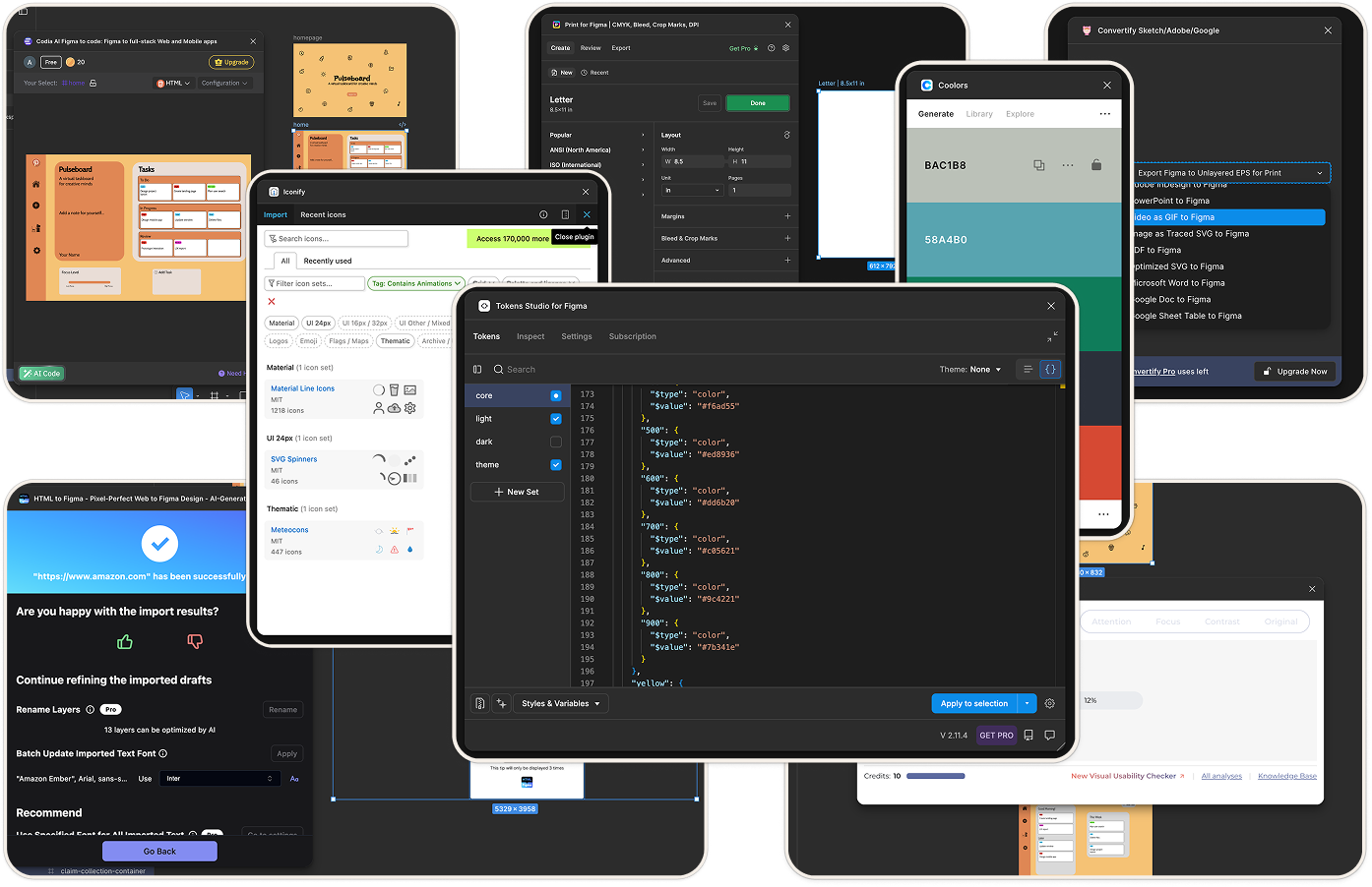
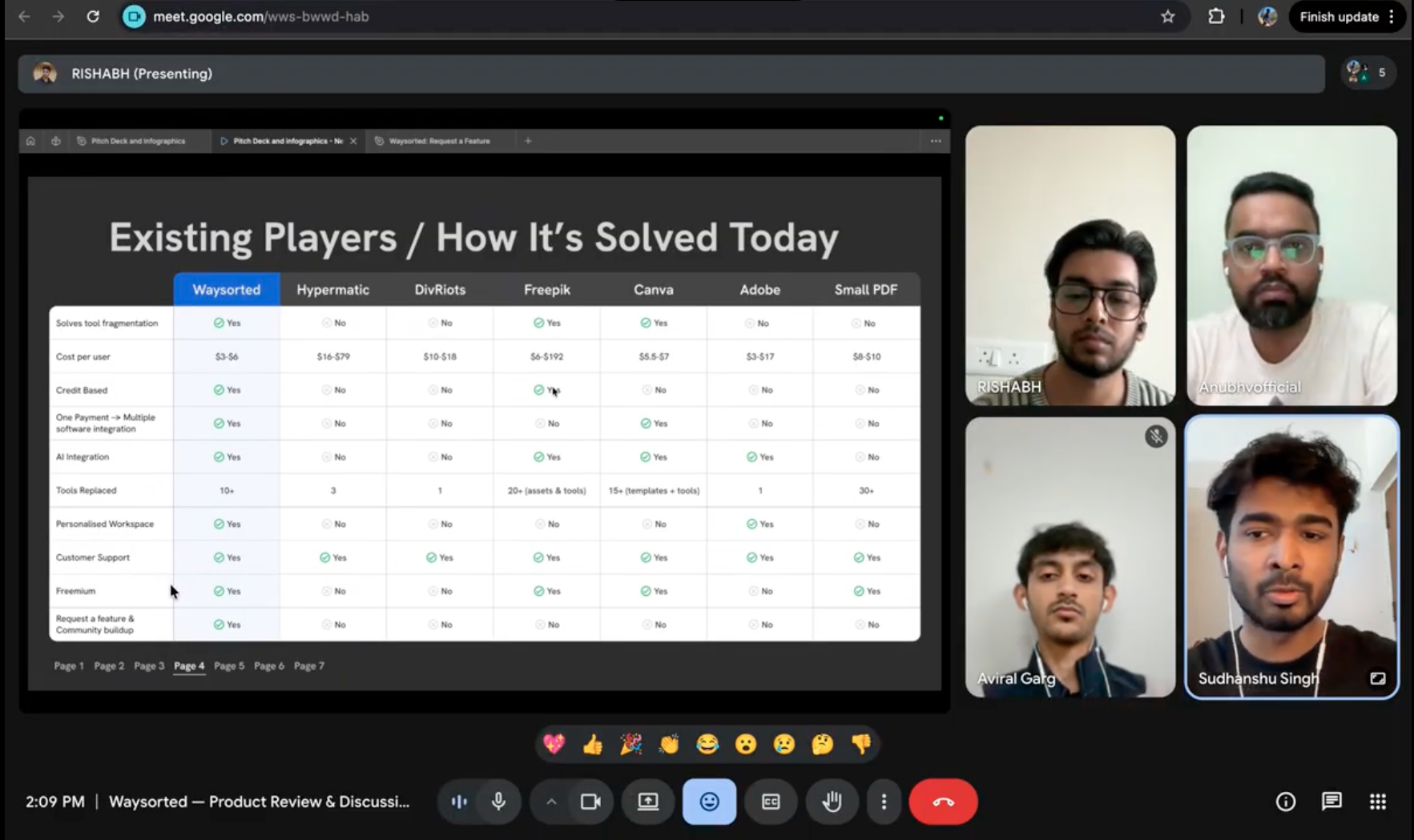
Before opening Figma, I audited 100+ plugins and surveyed working designers. Most failed the same way: too much interface for too little value.
That research became a priority stack, the non-negotiables any designer needs mid-session. That list became the product. Everything else was noise.
User Interviews
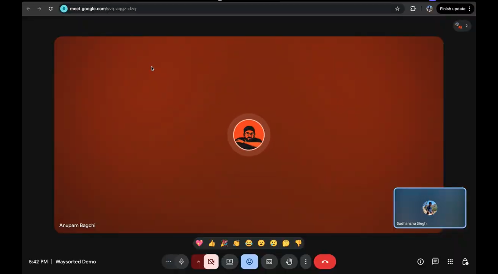
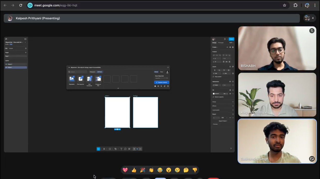
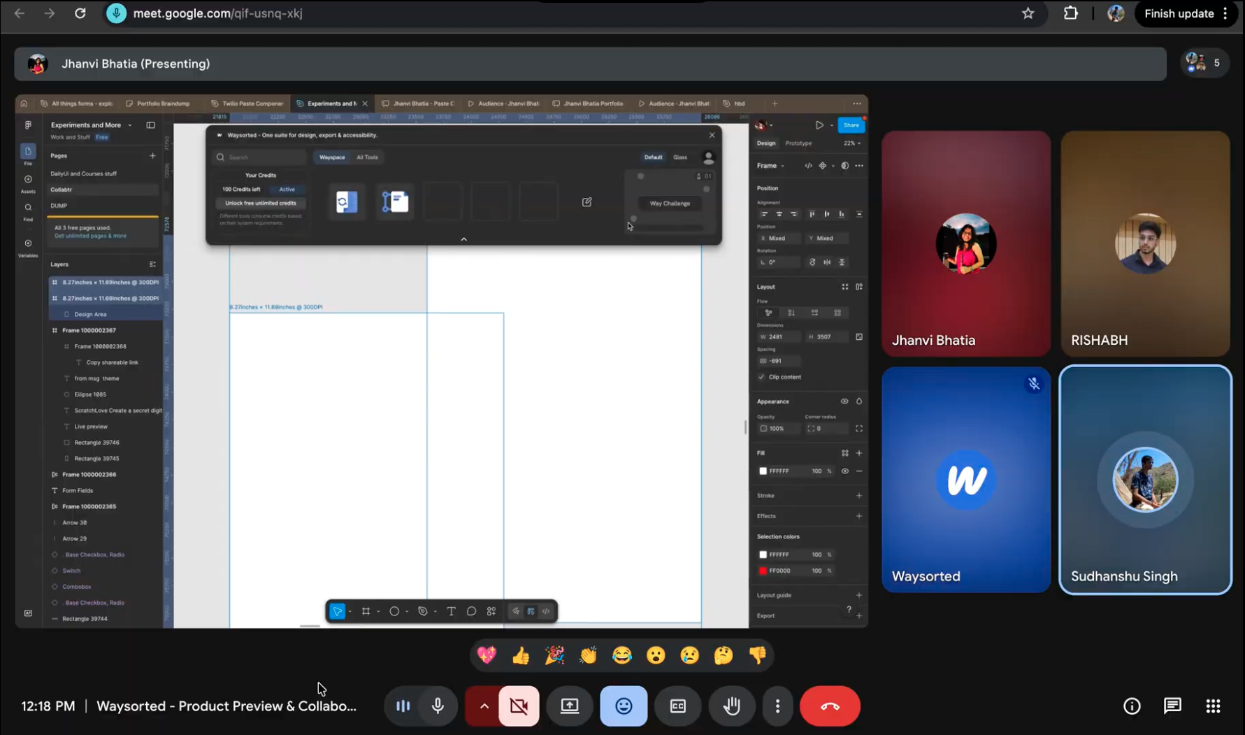
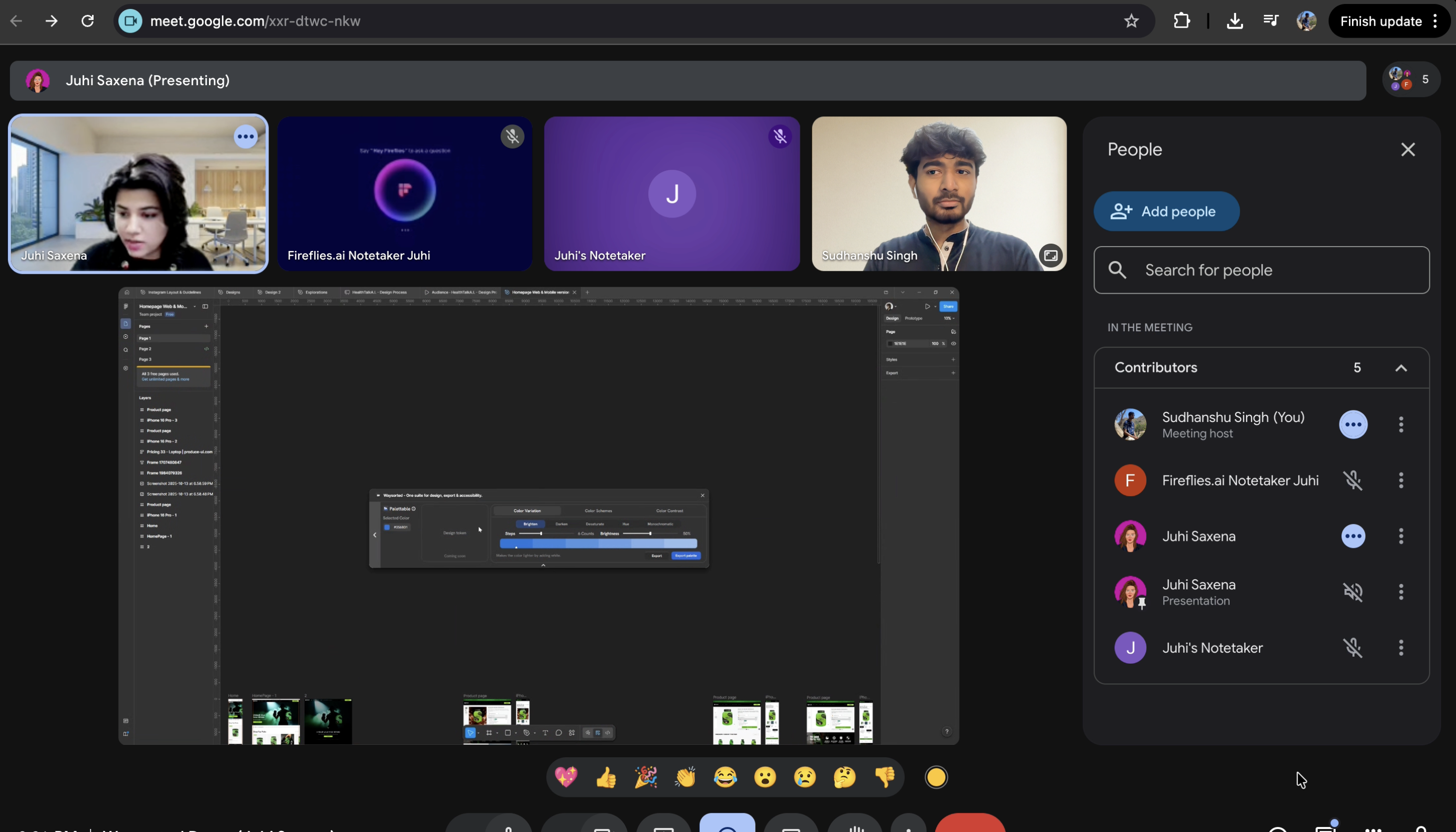
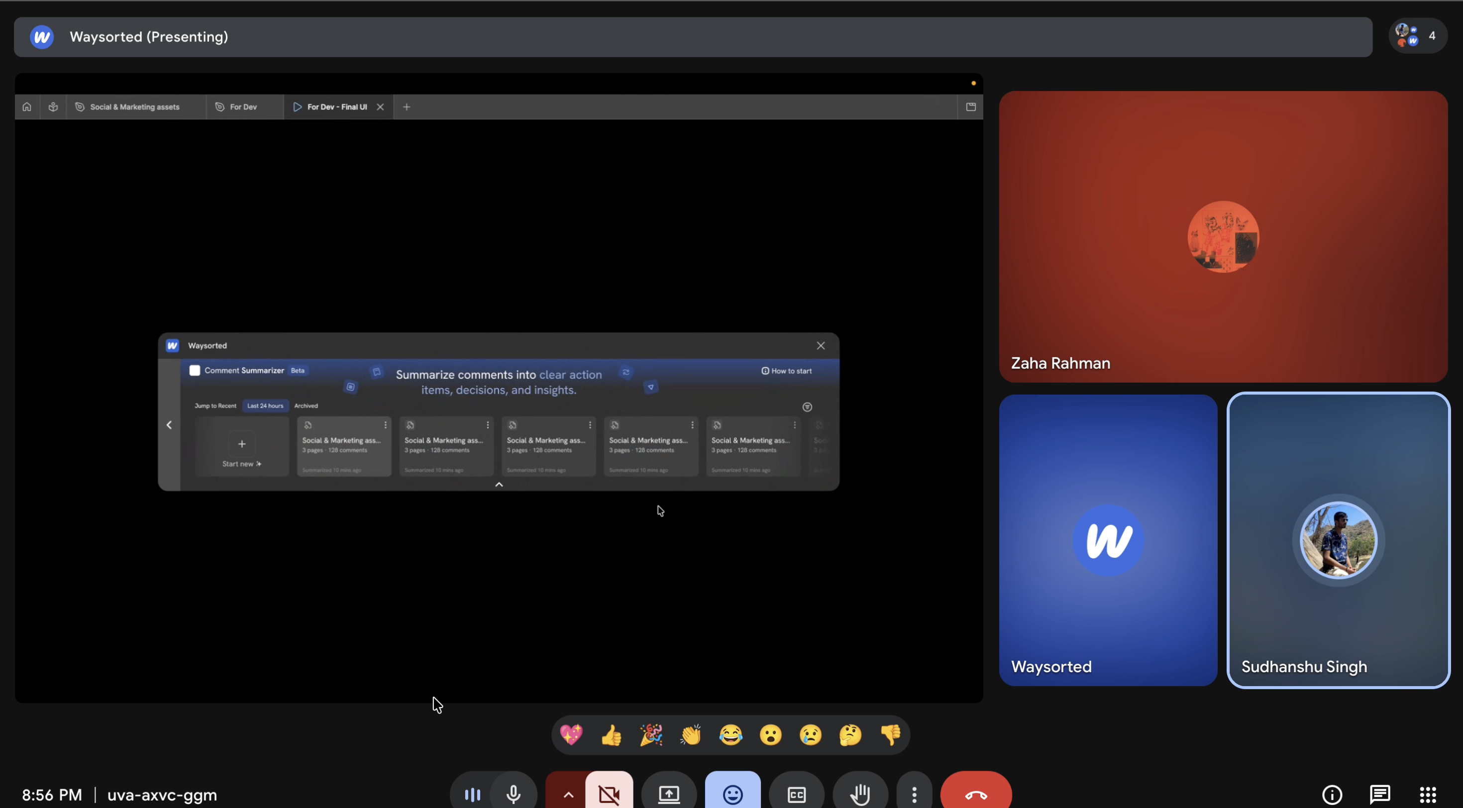
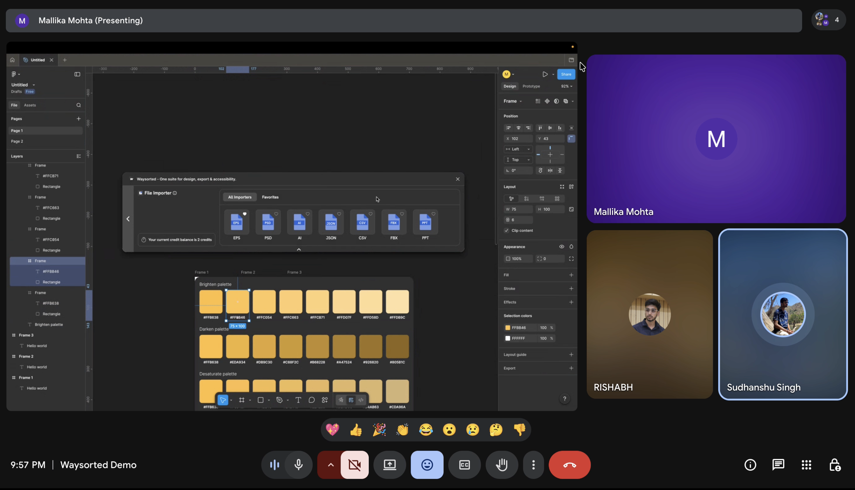
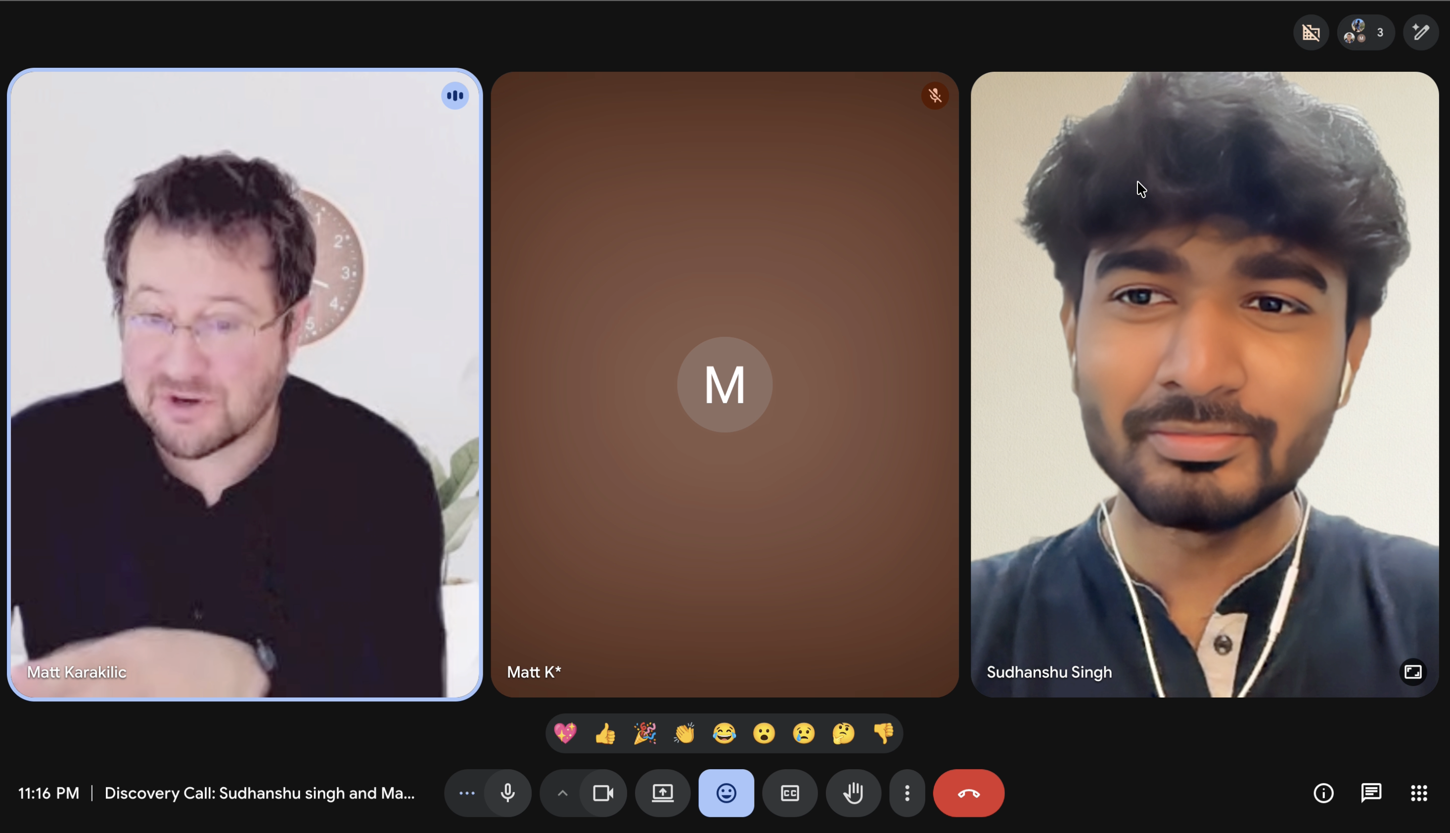
I sat down with 10+ designers to learn what they actually reach for.
Key Decisions
One hard constraint, set early: 1033×240px. No scroll, no deep hierarchy, nothing that needs explaining. Every later decision got faster.
Open the plugin, use the thing, get back to work. No onboarding, no upsell. We cut everything that wasn't the tool itself.
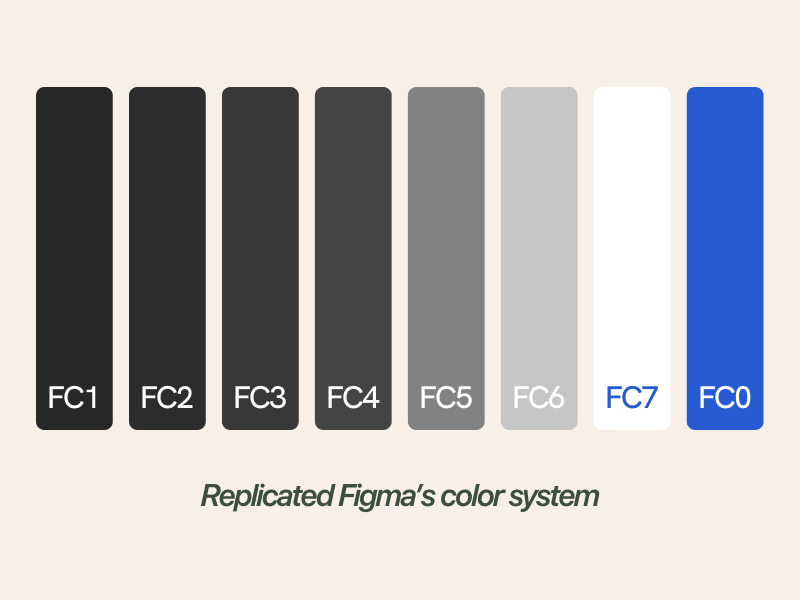
Same tones, same surfaces as Figma's own UI. So it stops feeling like a plugin and starts feeling like a feature that was always there.
The Interface in Use
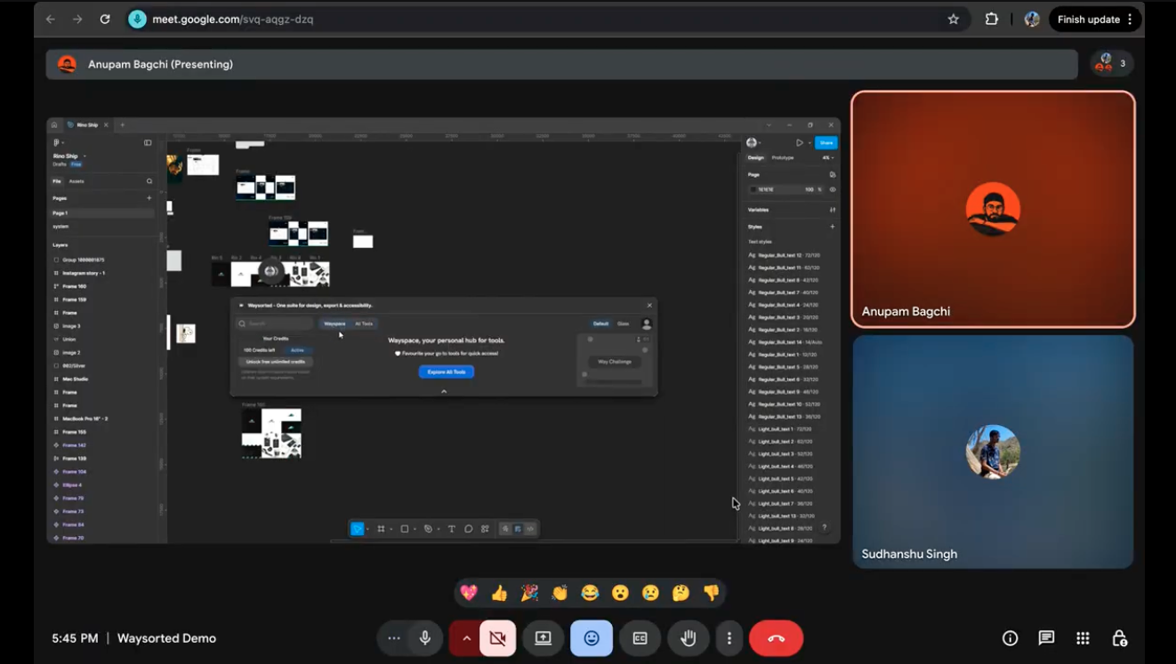
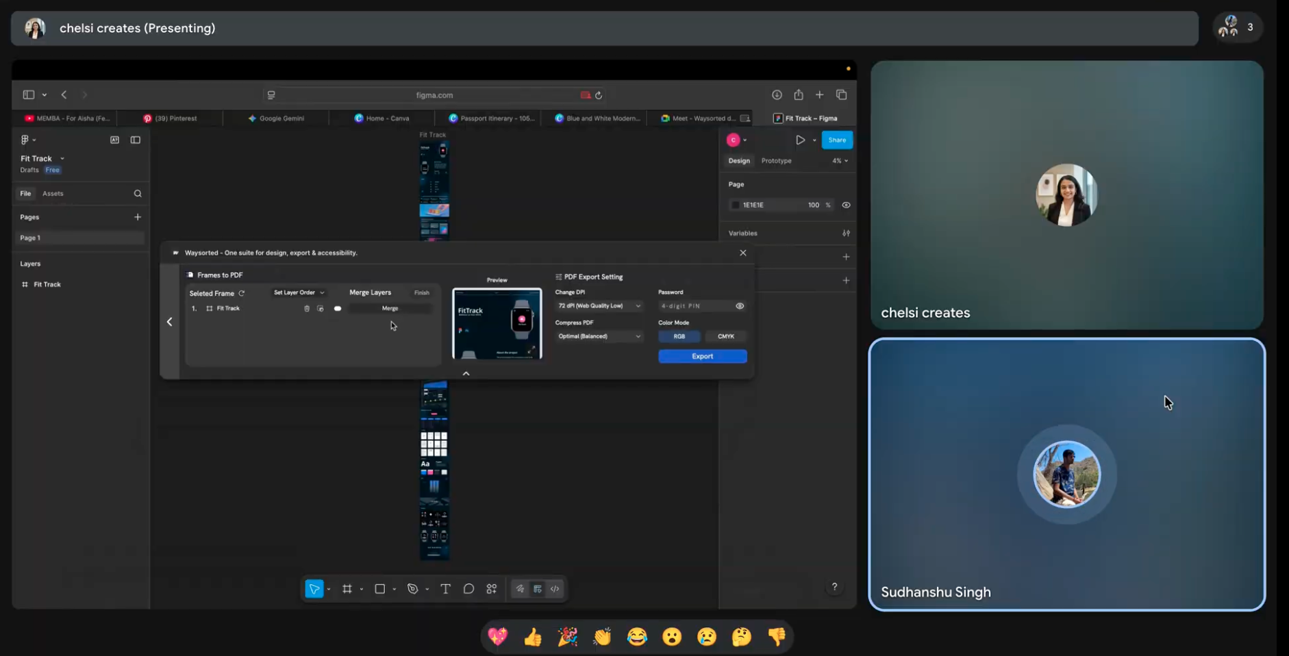
Every tool accessible without leaving the canvas. No tabs. No switching. No lost context.
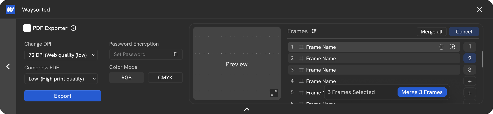
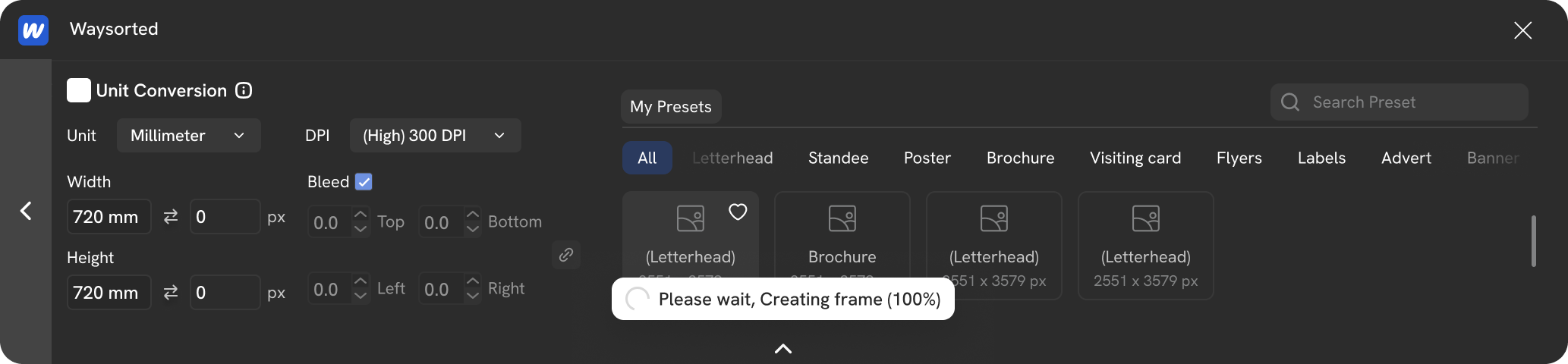
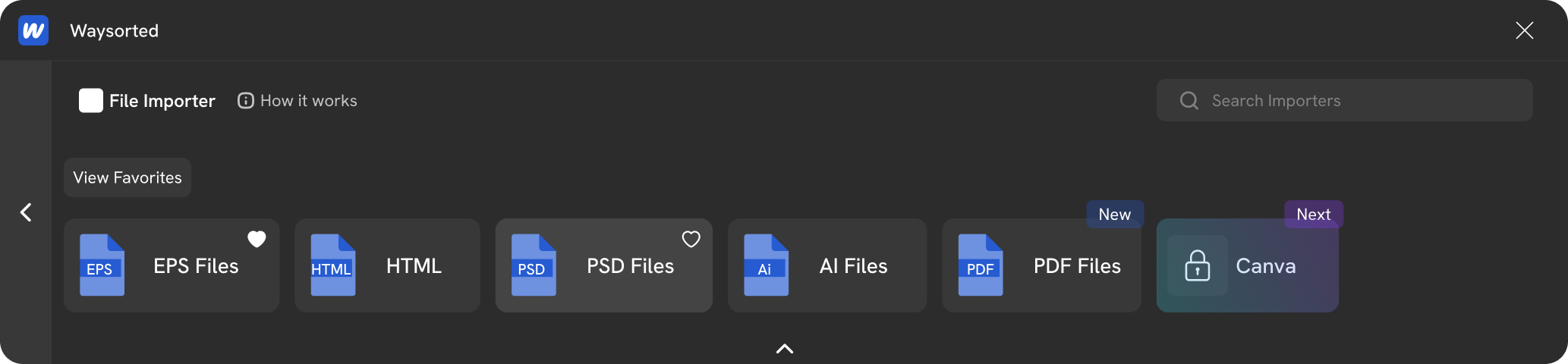
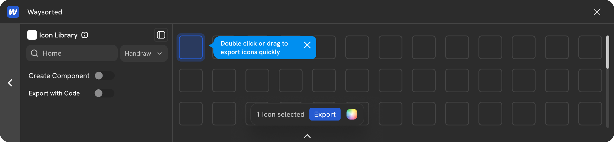
The full plugin at 1033×240px. Every tool, one deliberate decision.
In Motion
Product demo, chopped from the original campaign footage
Marketing & Distribution
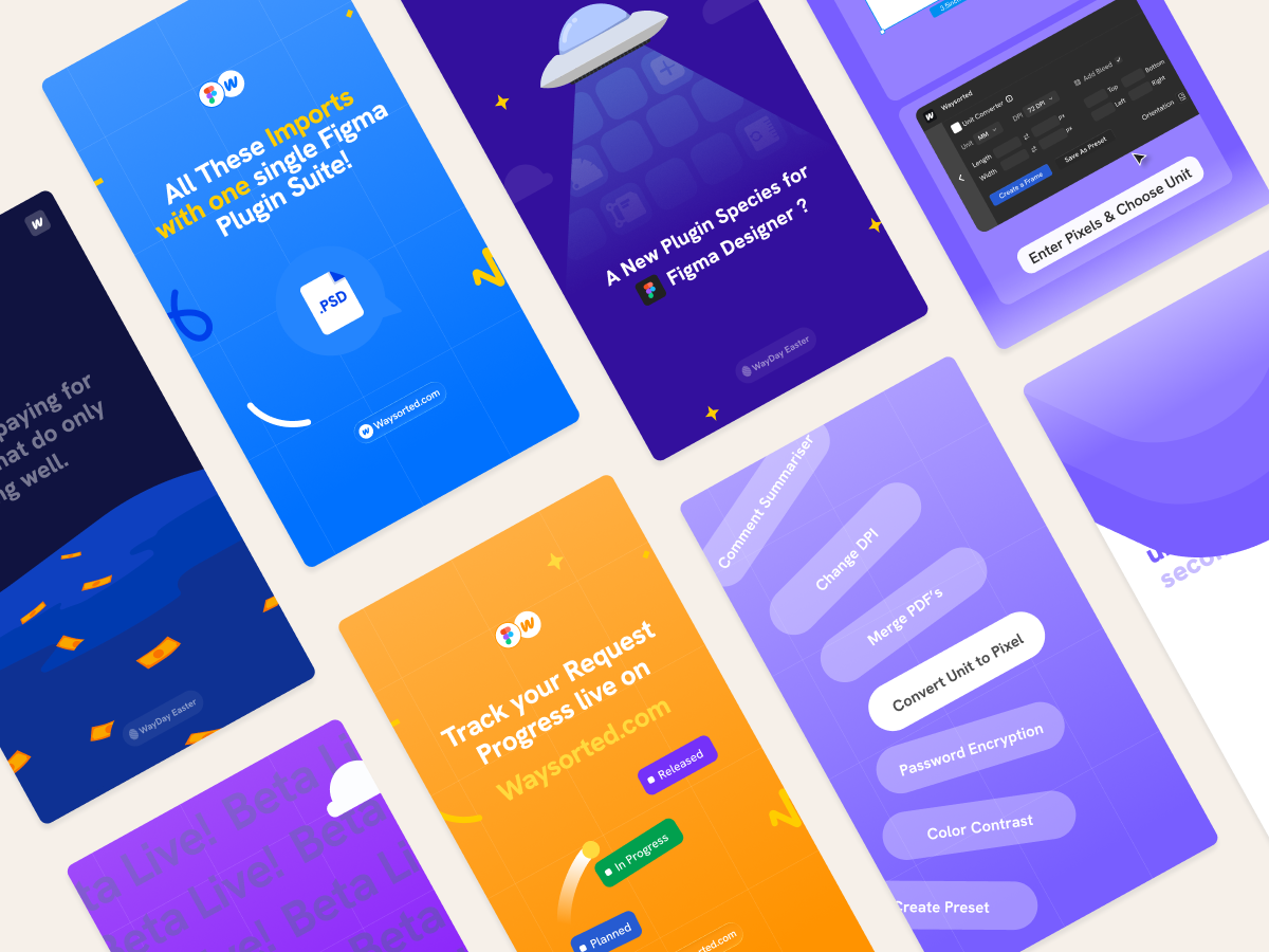
I designed and animated the reels myself, motion-first, built to show the plugin doing real work. Several crossed 10k+ views. Views converted to installs, not followers. A user base, not a brand.
Outcome
Accepted into Founders.INC and Nvidia Inception. 800+ users, plus an organic shout-out from a 170k-subscriber design creator. We didn't buy that reach. We earned it.
Reflection
We treated the first version like a product homepage, not a tool surface. Too many CTAs, too much noise. We should have started from the constraint, not arrived at it.
The website made the same mistake: it tried to do too much. A tool that reduces complexity shouldn't have a complex landing page. Simplicity first, always.